Overview
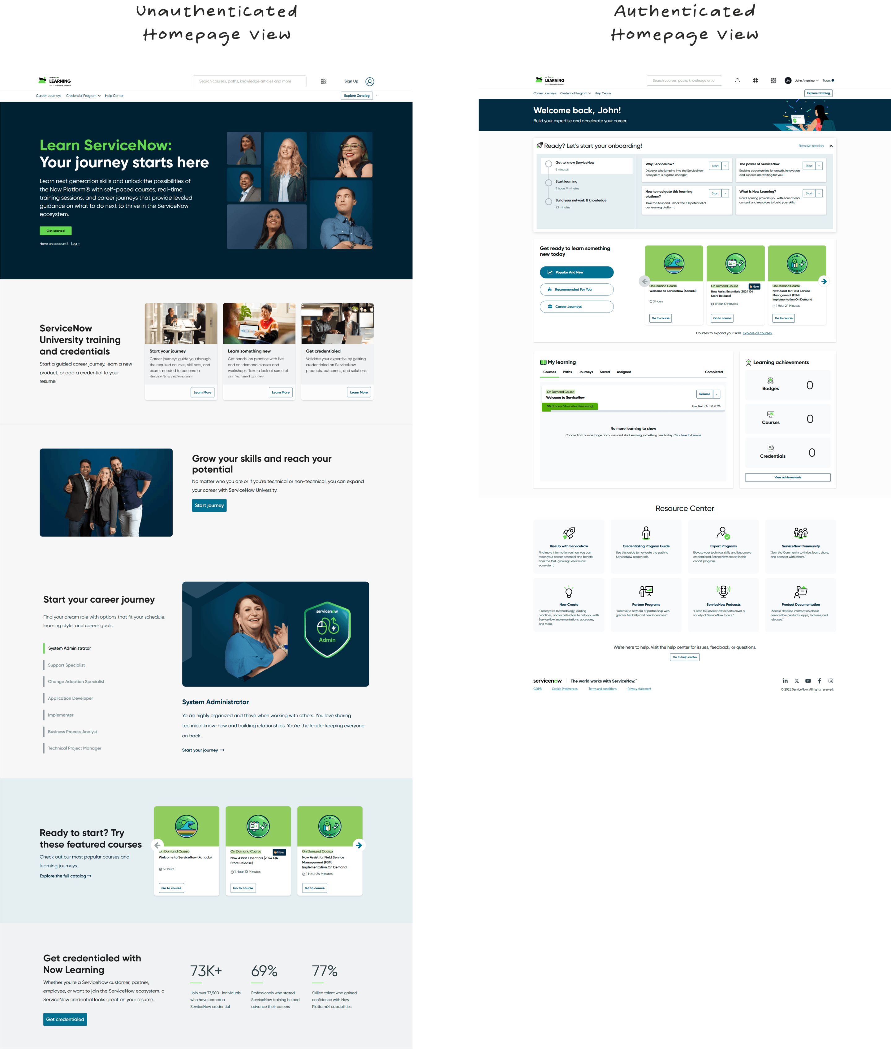
With the introduction of a brand new, authenticated homepage experience for learners within the Now Learning ecosystem, it was clear we had to do three things: Introduce learners to the platform, give them a starting point for their learning journey, and keep existing learners engaged. This problem was solved through three unique features and UI: Tooltips on the now learning platform, Video content to introduce the platform, and an onboarding checklist featured prominently on the homepage.
Client
ServiceNow
Role
Sr. Visual Designer
Duration
2 Months
Tools
Figma | After Effects | Photoshop | Miroboard | Illustrator
RESULTS
85%
of learners utilized onboarding section
44%
utilized tool tip
200K
users utilize homepage at least once a month
BACKGROUND
Making learning fun while giving users tools to succeed
Our small UX team utilized several key engagement techniques to keep users hooked on learning, while building out a robust UI that could be built on for future features and organization needs.
APPROACH
Hierarchy
- Tell users what they should do first, while still giving them the reigns
- Have levels of achievement, not a huge list of to-dos
- Build a fun ecosystem through small tasks
Variety
People learn in different ways by incorporating video content, tooltips, a checklist, and some compelling graphics along the way, we were able to onboard a larger variety of users
Timeliness
People love a good roadmap, and we were able to give users a jumping off point, rather than a blank dashboard with nowhere to go. This gave users time to stretch out and explore everything Now Learning had to offer at their own pace
GOALS
Goal One
Have a majority of users complete a portion of onboarding
Goal Two
Increase average course completion % amongst current users while driving more external users to signup for Now Learning Profile
Goal Three
Reduce users who never complete one course
Goal Four
Qualitative survey of program satisfaction
DISCOVERY
Our learners like a good challenge
- While doing research into strong onboarding methods, we discovered a combination of gamification, checklists, and walk through guides had become more popular and useful as UX tools
Engaging Tools for Smart Users
For a high-tech, cutting edge tool like the Now Platform, our users needed depth and sophisticiation
Evolution over time
The interface needed to be future-forward, taking into consideration new and different types of content
DISCOVERY
Brand new real estate
Since we were building a net-new item there was a need to have it be prominent, but not interrupt existing users content and progress. Additionally, we new the form factor had to be accordion or collapsible in nature
Onboarding Module
The heart of the onboarding experience, for new and seasoned users
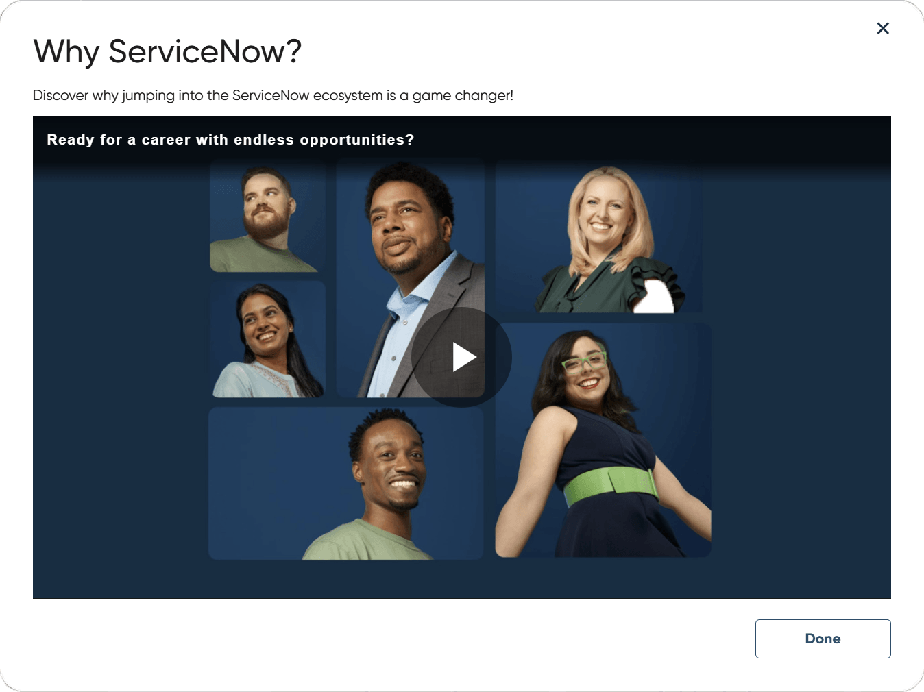
Tool Tips and Video Content
Merging different learning styles, and adding certainty for users who are hesitant
USER FLOW
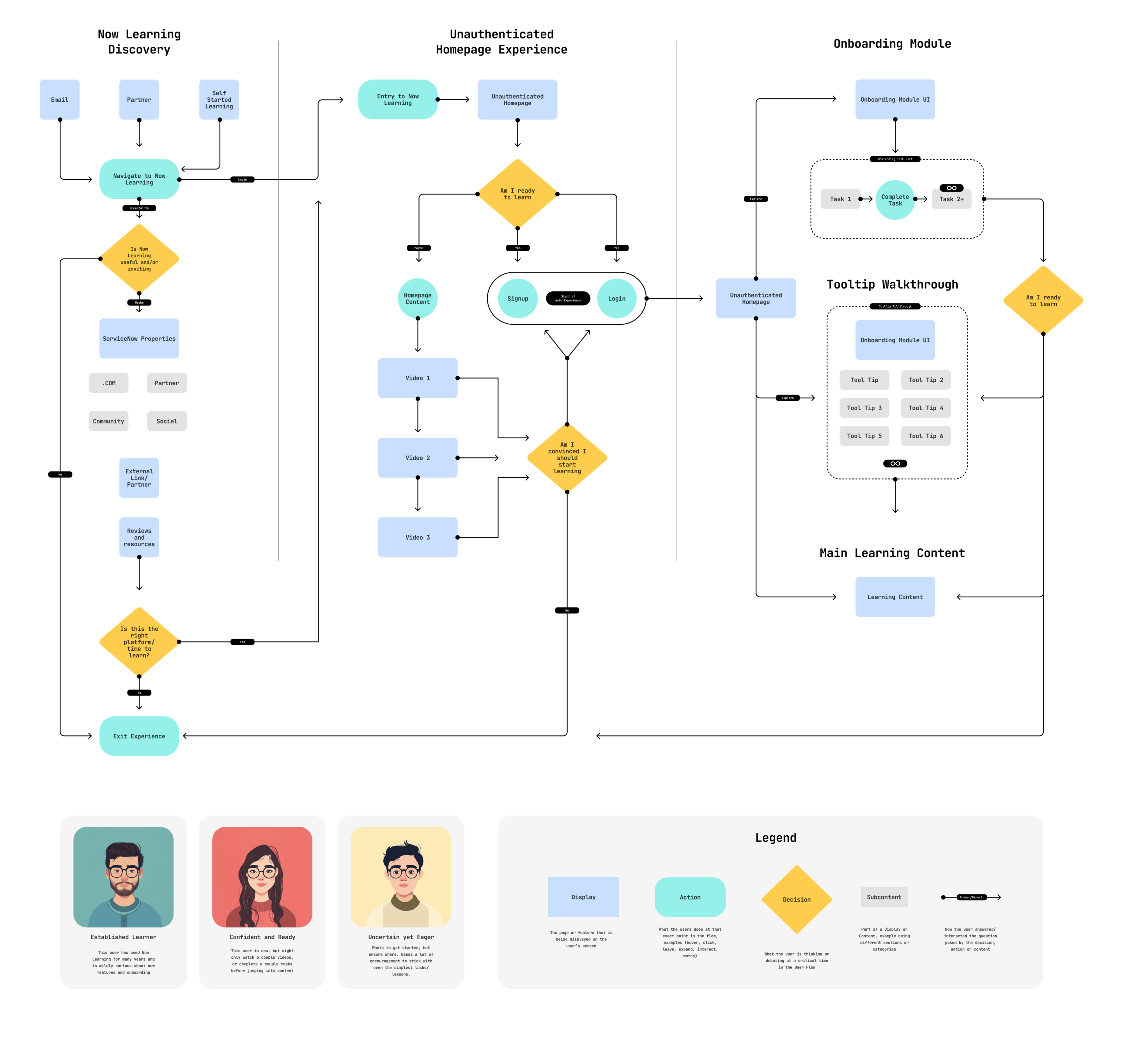
A Three-Part User Journey
We mapped out the experience for all users on one concise user-flow, with three key personas at the heart of it all. For this to work, we had to keep even the most hesitant or head-strong users in mind.
Mapping out content, merging with engineering
We mapped out the experience for all users on one concise user-flow, with three key personas at the heart of it all. For this to work, we had to keep even the most hesitant or head-strong users in mind.
ONBOARDING
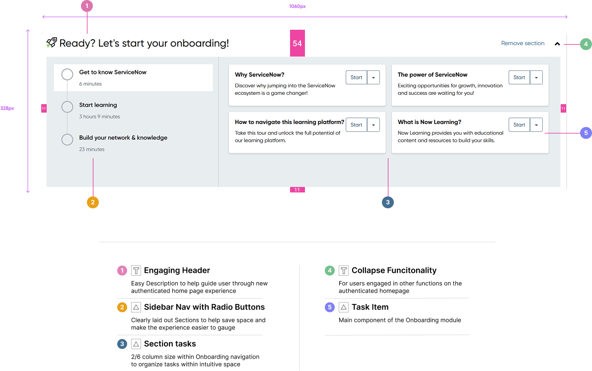
High Level onboarding to-do list
Having a strong focal point as part of the UI was critical for checking back in on onboarding progress. This Onboarding module had multiple features to elevate the learning experience, for new and current users.
ONBOARDING
Multiple Angles of Attack
Some learners respond well through video content, through hand-holding instructions, and then finally some love a checklist and need a way to organize their big ambitions with learning. Our approach covered all three
ONBOARDING
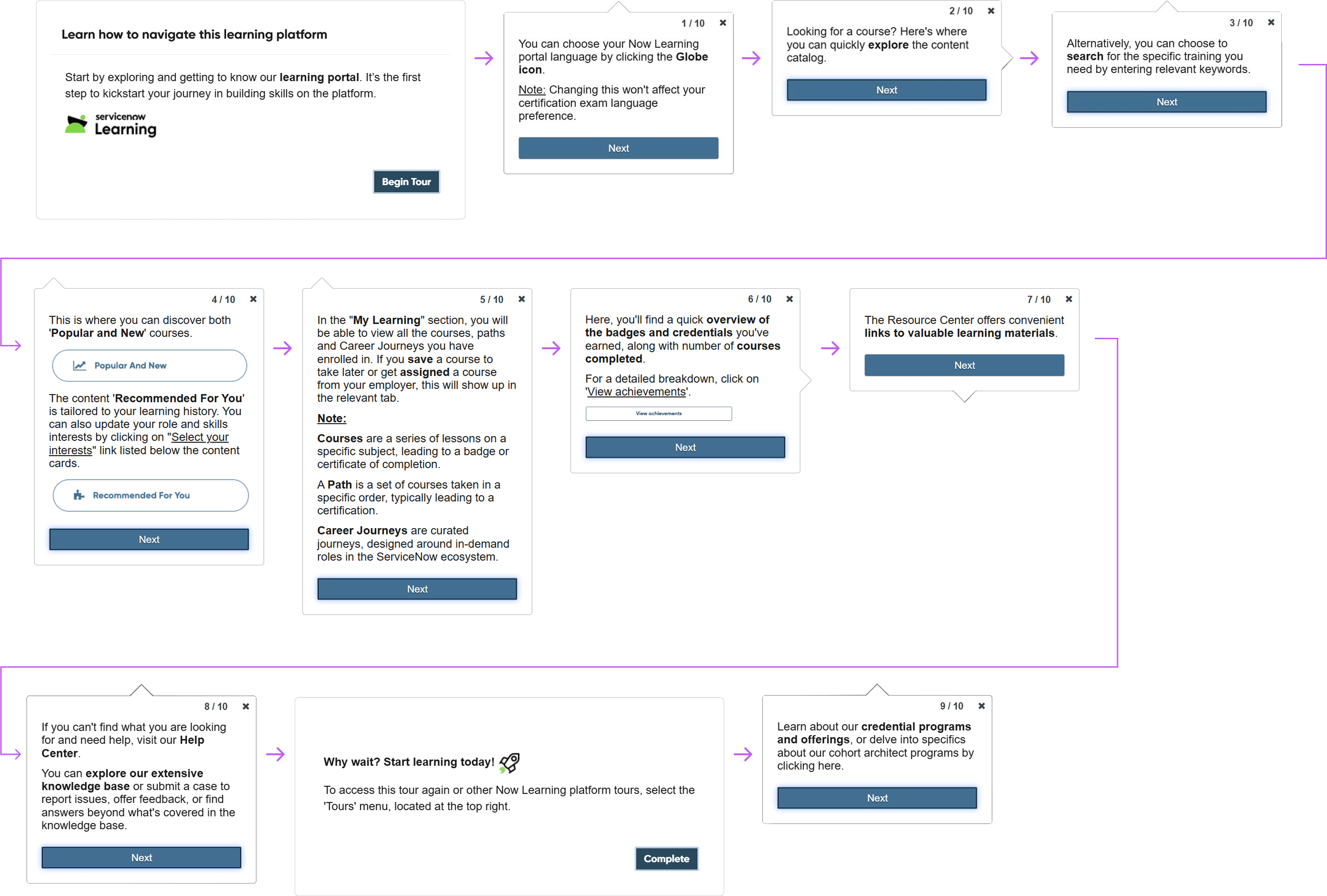
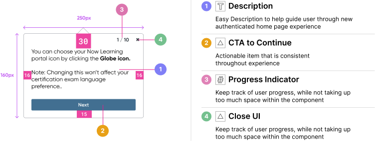
Tooltips for everybody
Some learners respond well through a literal, hand-holding walk through of the UI, as not only had we introduced a new authenticated homepage experience, but many of these features were groundbreaking, organization wide
ONBOARDING
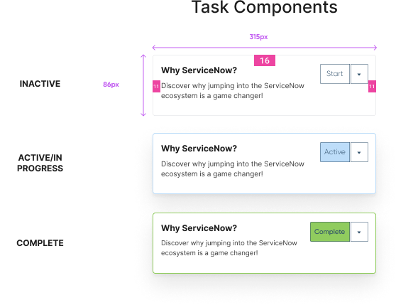
Detailed view of overview task
This base-level component had three distinct variants, giving visual feedback to progress and allowing for a “refresh” if needed in the future.
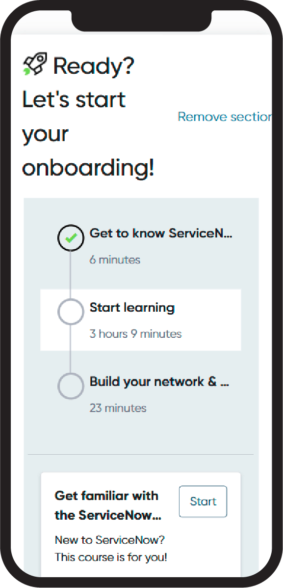
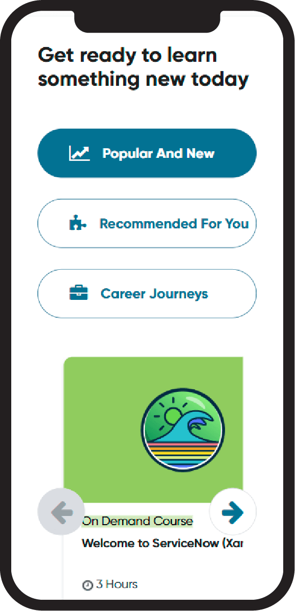
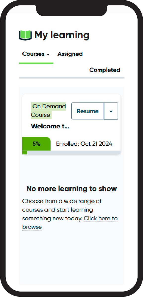
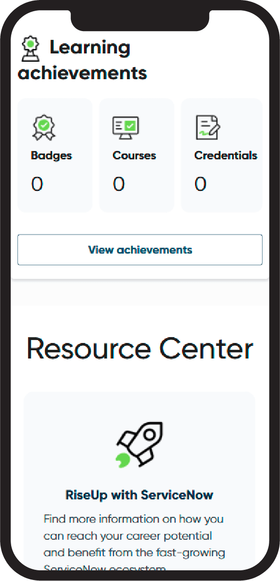
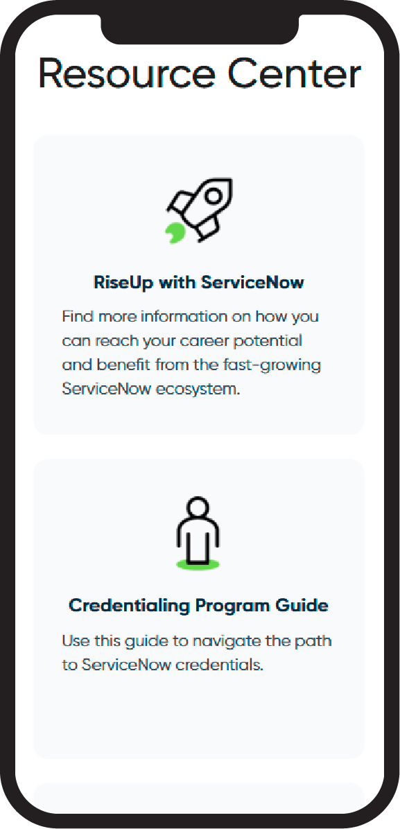
Mobile Screens
Key Takeaways
Takeaway One
Better engagement than ever, with new data-driven measure to users' onboarding success
Takeaway Two
Users engaged UI all the way to end, with the majority of users participating in onbarding
Takeaway Three
Almost every user engaged all three types of onboarding tools
Takeaway Four
Other orgs including community copies/adopted tools

