
The Problem
Lack of flexibility, options to differentiate, and cohesive layouts left financial identity company missing out on engaging landing pages.
The solution
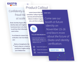
Simply put, sometimes more is better. The sales and business dev team had very little options for webinars, events, content, product announcements etc. By giving them multiple options and flexibility, it was more empowering to sales to have a bright, modern set of options to build their ideal landing pages.
More Options for Mobile
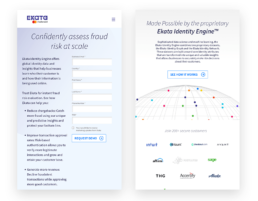
There were no defined styles for breakpoints or mobile modules. KNAK based Wordpress layouts were added for both tablet and mobile, and adapted from larger, media-driven pieces on desktop down to quick and digestible pieces of content for interested customers on mobile.
Integrating Clients and Identity Engine
The Identity Engine is everything to Ekata Mastercard, so keeping it brief yet informative was key for this part of the main boilerplate of information. Also adapting the layout to showcase the top existing customers for Ekata was a key motivator in restructuring the page.
Better CTAs
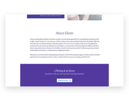
The data showed people got lost down the page, and there was little to no CTAs after the initial form at the top. Additionally, the huge wall of text at the bottom did no favors for falloff/exit rates. A much brighter, harder to miss CTA showed engagement with the first pages which were rolled out using the new modules.