
Overview
Quick-turnaround improvements to main learning UI within Now Learning, nearly every single piece of content featured on Now Learning with the exception of in-person and specialized tasks was featured in here. Lots of direct feedback paired with class drop off rate focused on a need for immediate non-sprint based improvements with minimal developer time and focus on lowering drop-off rate, course completion time and improving completion rate of average course.
Client
ServiceNow
Role
Sr. Visual Designer
Duration
2 Weeks
Tools
Figma | Photoshop | Illustrator
RESULTS
9%
Faster Content Completion Time
45%
Completion After Three Months
4%
Lower Immediate Drop-off Rate
BACKGROUND
An urgent need for quick improvements within fundamental UI
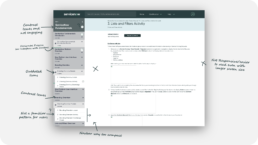
Scope: Simple, fast-loading UI featuring sidebar nav, nested course content, and simple design interface. Within the NDS (Now Design System) it felt dated, and was too cramped for content, and users had directly complained about it.
APPROACH
Clarity
- Get rid of percentage decimal points for completion (rather than 87.4567% simply indicate 87%)
- Widen total column of course nav to 400px
- Distinct completion % indicator for Path level (top element)
- Add Motion Indicator and color background for new content
- Make percentages more distinct compared to other content
Accessibility
- Checkmark instead of 100%
- No horizontal progress bars
- Better text/background contrast
Quick Access/Resume
- Add margin at bottom of list of course content to ensure last element doesn’t get lost to navigation buttons
- Make external content distinctive with #293E40 background, similar to how a new “path” element is portrayed
GOALS
Completion %
Increase user completion percentage across all content for new and existing users
Accessibility
Allow more content to be accessible quicker
Content Differentiation
Build out components for new, updated and external content
Timing
Complete it within two week constraint
DISCOVERY
Keeping Learners in mind while working with tight constraints
- User feedback was a crowded, hard to interpret interface
- Many users stopped/didn’t progress quickly through learning content
- There was no budget for a full redesign
- Decided to do a card sorting exercise to prioritize, then light user feedback
DISCOVERY
Quick look into comparable platforms and UI
Looked into several systems including Salesforce Trailhead, Udemy, others due to time constraints had to design without net-new UI. The main takeaways as related to sidebar/side navigation is that content is much more visually distinctive, engaging, and has ample breathing room.
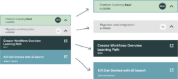
SIDE BY SIDE
More breathing room with a more intuitive set of components
Slight as we as dramatic adjustments based on user feedback allowed more information vertically, and longer content titles horizontally.

FEATURED COMPONENT
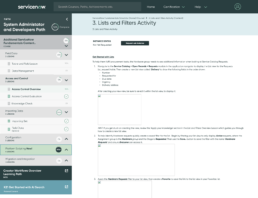
Updated values and tokens for better contrast
Each Component was updated to better align with WCAG 2 Contrast and Color Requirements as well as matching external UI for a better overall experience

FEATURED COMPONENT
New tab types and color treatment
Immediate feedback was users could now find the content type, as well as individual section much quicker with more of each section being visible, including active, complete, and new states

ADDITIONAL DISCOVERIES
Improving Learning Graphics for content creators
In addition to a better sidebar nav, I was able to create several example sets with ServiceNow Brand Powerpoint based components, so that class and content creators could have a uniform look and feel for graphics they created (there were over 200,000 graphics/images within Now Learning strictly for course content)
KEY TAKEAWAYS
Better Alignment
The new UI looks and feels more like the rest of the Now Learning org
Better Results
9% faster completion time and 4% reduction in complete drop-off rate
Future-Proofed
Designers who work on this nav and screen(s) now have a fully set of annotated and structured Figma components