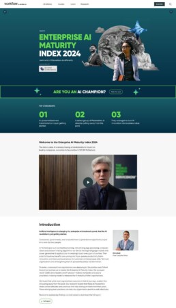
Build a deep pillar page with data visualization from the ground up
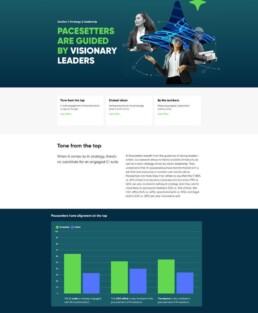
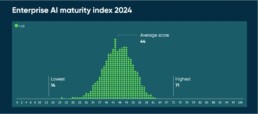
The AI Maturity Index was a cross-org partnership between learning, design, .COM, community, and more where the learning UI/UX team was brought in to the mix to highlight ways our data centered around AI, Pacesetters, priorities, and of course cost optimization could be presented, plus performance and page layout. I was able to prepare the base-level series of graphs and charts to be displayed on this extremely large, content rich page. Below there are a selection of pieces which are from the initial mood board/data viz set.
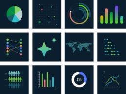
Data in Motion
Our team built the promo for the page and animation by combining lots of our great mood boarding and existing learning assets for Now Learning (we created the general look/feel of AI course content months before .COM) and were able to blend collage-style graphics with strong data viz.
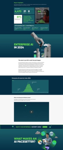
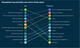
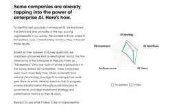
Shift in priorities
This type of cosmograph showcased changing priorities for high-performing companies over time utilizing ServiceNow’s main brand colors.
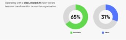
Doughnut Pie Chart
Showcasing individual data points (aka parameters) utilized a simple strong monochromatic layout with lite css animation.
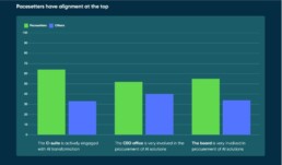
Bar Charts
Custom-coded bar charts utilizing some deep-dive tertiary colors featured in our brand were able to add some spice to a relatively dense and long piece of content.
Radar Charts
To create a visual on several non-quantifiable ratings for pacesetters vs others, we animated a custom radar chart, which was the most engaged visual on the entire page.
Area Chart
This is one piece of data I wish I would have visualized differently looking back, but due to technology constraints and the need to animate, the “grid” of dots was uneven depending on your browser/device. However, from a legibility standpoint, it still told an effective story while remaining on brand and lightweight in terms of performance.
Looking into 2025
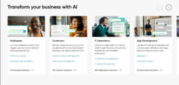
After I left the Now Learning UI/UX team, it was great to see an evolution into the glassmorphic/deep diagram system that showcased better photography and moved away from the collage based style that defined our 2024 visuals.
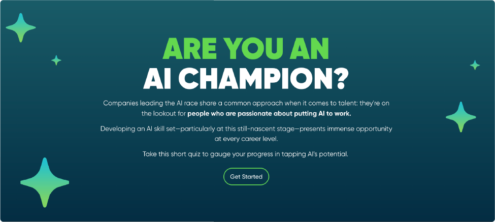
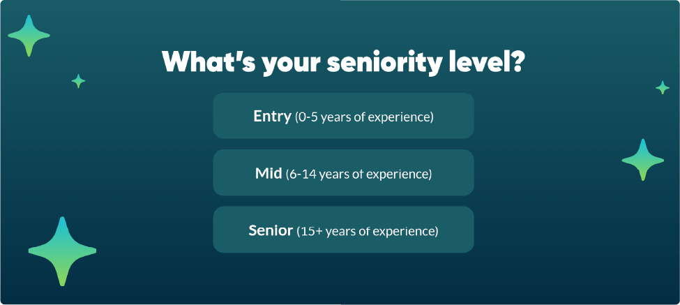
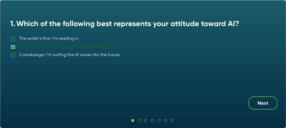
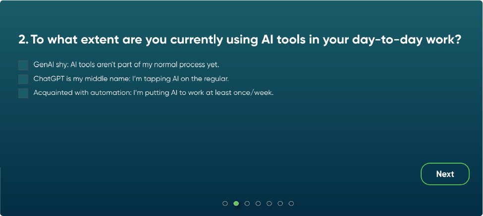
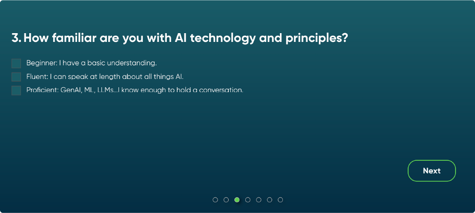
Custom Quiz to engage users
One of the best features of this pillar page was a customized quiz to take users and turn them into potential customers in the marketing funnel pipeline, by having a quick piece of engaging material that built upon the great content earlier in the experience.