Skinny Pop Rebrand Thoughts and Ideations
A rebrand that falls short of the “pop-tential”.

Popcorn is one of the most fun foods, and recently Skinny Pop tried to bolster their brand with an expensive launch, several celebrities and of course a new packaging design. As part of Hershey’s large arsenal of snacks, this should have been a win, but I think it falls flat for a couple reasons.
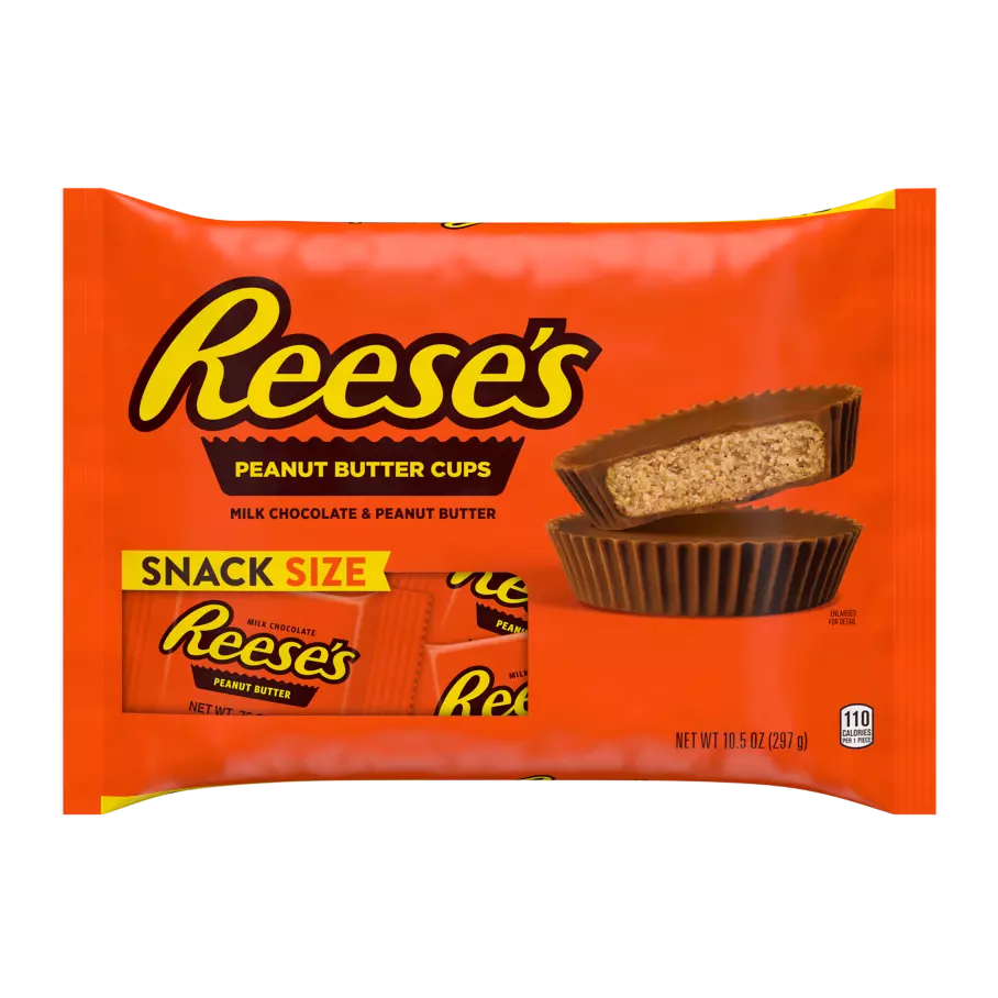
Just some of their Iconic brands with classic/instantly recognizable packaging:
- Jolly Ranchers
- Twizzlers
- IceBreakers
- Reese’s (did you know they make Reese’s-filled pretzels)
Just look at how this packaging pops off of the page:
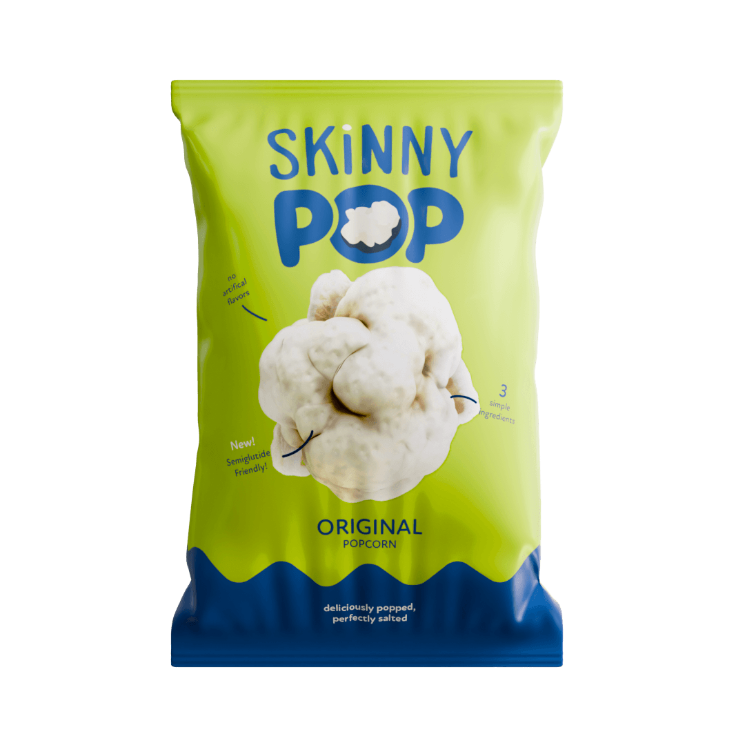
First problem: lack of cohesive color strategy.
Food is a instinctual, impulsive purchase, typically backed by colors of green, yellow, orange and red. There are exceptions, but manufacturers literally have it down to a science with how customers get their eye caught with enticing, eye-catching designs. Usually any supporting colors to back the main block color are analogous, with strong contrast and saturation. Skinny Pop falls flat with both with a seemingly confused two-tone design, with large swaths of white, and no real “hero” color.
Second problem: Focus and Hierarchy.
The logo is large and in charge, but it is broken up by lots of objects of similar size on the page. The type/product flavor is hidden, and the “O” of Pop gets lost, and The white looks… cheap. There is a reason there isn’t much white on other snack packaging. It gets very reflective, dirty, and is invisible on lighter store shelves and displays.
Third problem: The Drop Shadow non-committal.
I know what popcorn looks like, and adding a very one dimensional drop shadow behind random pieces of popcorn doesn’t really do anything more to sell it. It doesn’t show quantity or quality, and is kind of not committing to a strong point of view. Look at the drop shadow of the Reece’s cup on the packaging above, it show a strong angle, incredible contrast, and has an “attitude” of being crips, large relative to the packaging.
My 5min take on a new direction.
I would do the following:
- Ditch the red or blue (can’t have both)
- less vertical divides
- Highlight the product
- Simulation to add scale and quantity
- No drop shadows
Here is a block logo and packaging mockup I created in about 15minutes of work to get across the general look and feel of a strong potential direction.
![]()