
ESPN Branding for NBA Basketball, 2025 thoughts
ESPN really knocked it out of the park and moved on from the “Red and Blue” Logo treatment
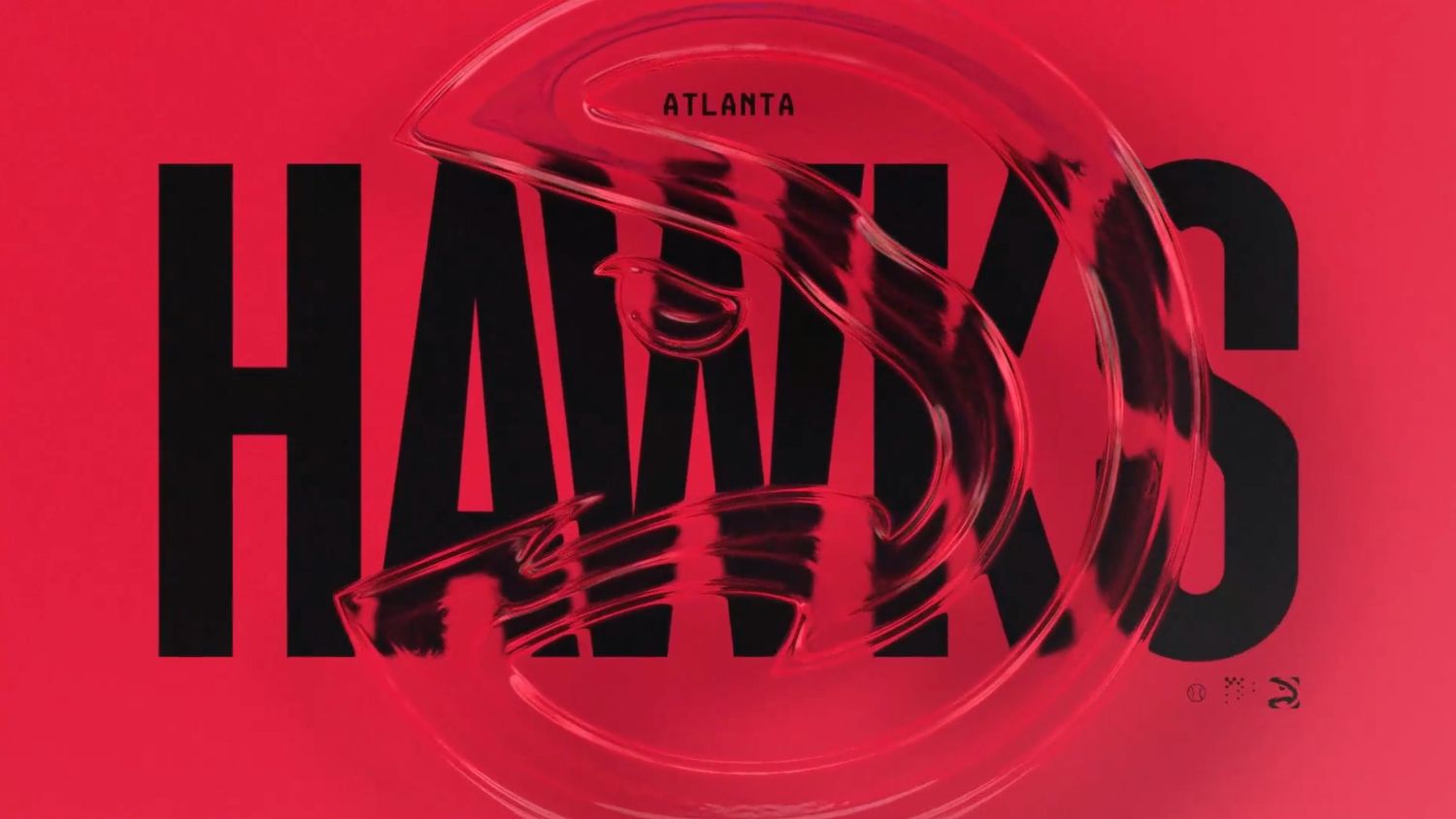
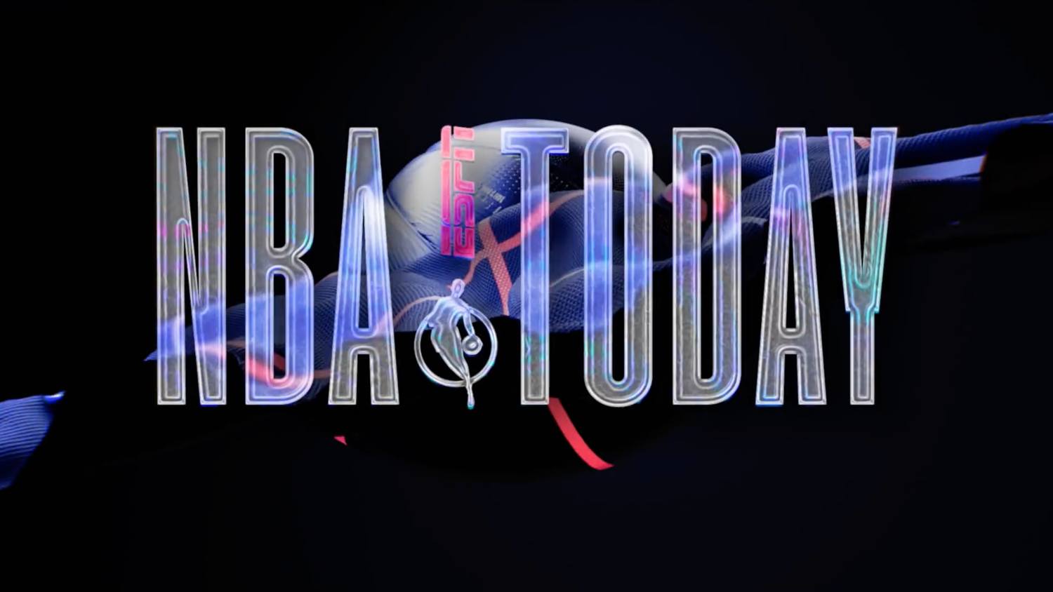
In 2022, ESPN launched a whole new suite of graphics: everything from overlays, matchups, stats, bumpers, transitions and more.
They look exceptional:
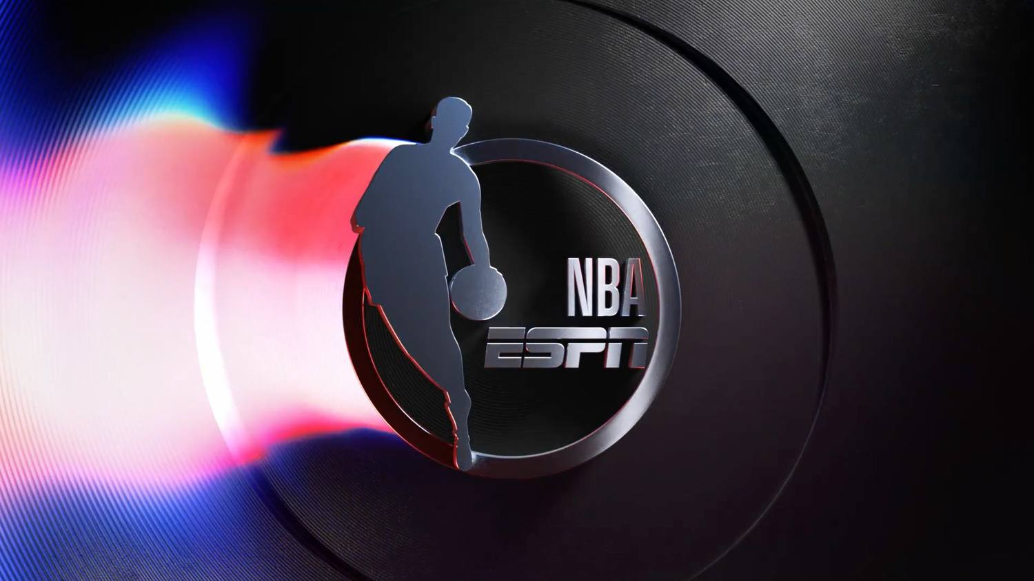
I think why these work so well is a combination of factors that is helping evolve what the new NBA looks like. The NFL has it down with a classic, almost prestigious quality where history meets strong music selection, incredible cinematics, and the complete head-to-toe player uniform meets field meets stadium ensemble. Basketball is inherently a much more crowded visual medium: you see people in the stands as a great percentage of the screen, courts are busy with complicated lines, sponsors, and the basketball net, thought it is a much tighter look, still holds a ton of visual static and noise. These overlays get ahead of that by doing the following:
- Layering and Transparency
- Depth and new “arenas” for graphics to play in
- Extremely creative typography, colors, gradients and physics simulations
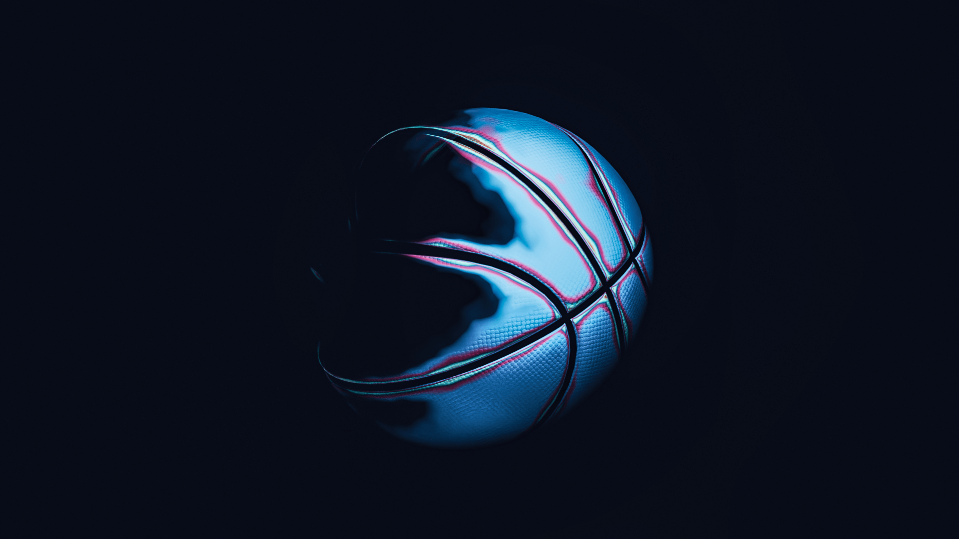
While these graphics are now over three years old, they are still extremely modern and inspiring. Here is my take utilizing blender on the “ethereal” look
You can see all of the graphics at:
https://www.newscaststudio.com/2022/10/04/espn-nba-broadcast-design-branding/