ESPN Branding for NBA Basketball, 2025 thoughts
ESPN really knocked it out of the park and moved on from the "Red and Blue" Logo treatment
In 2022, ESPN launched a whole new suite of graphics: everything from overlays, matchups, stats, bumpers, transitions and more.
They look exceptional:
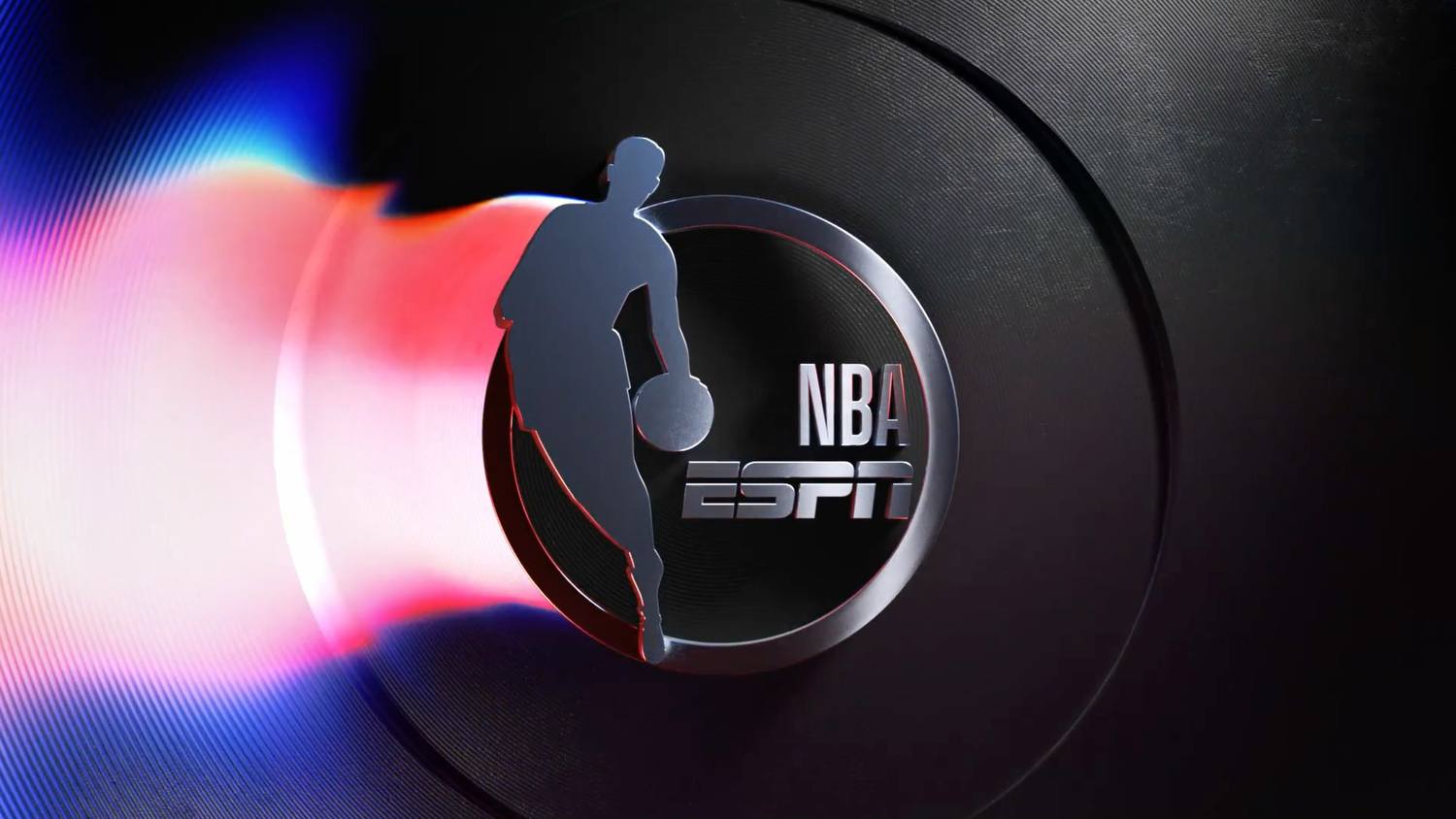
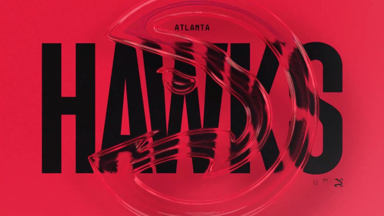
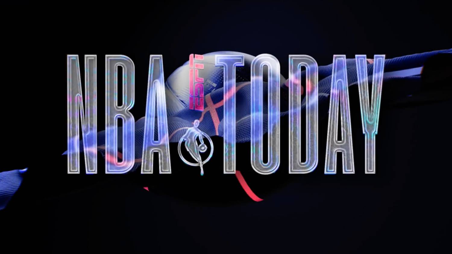
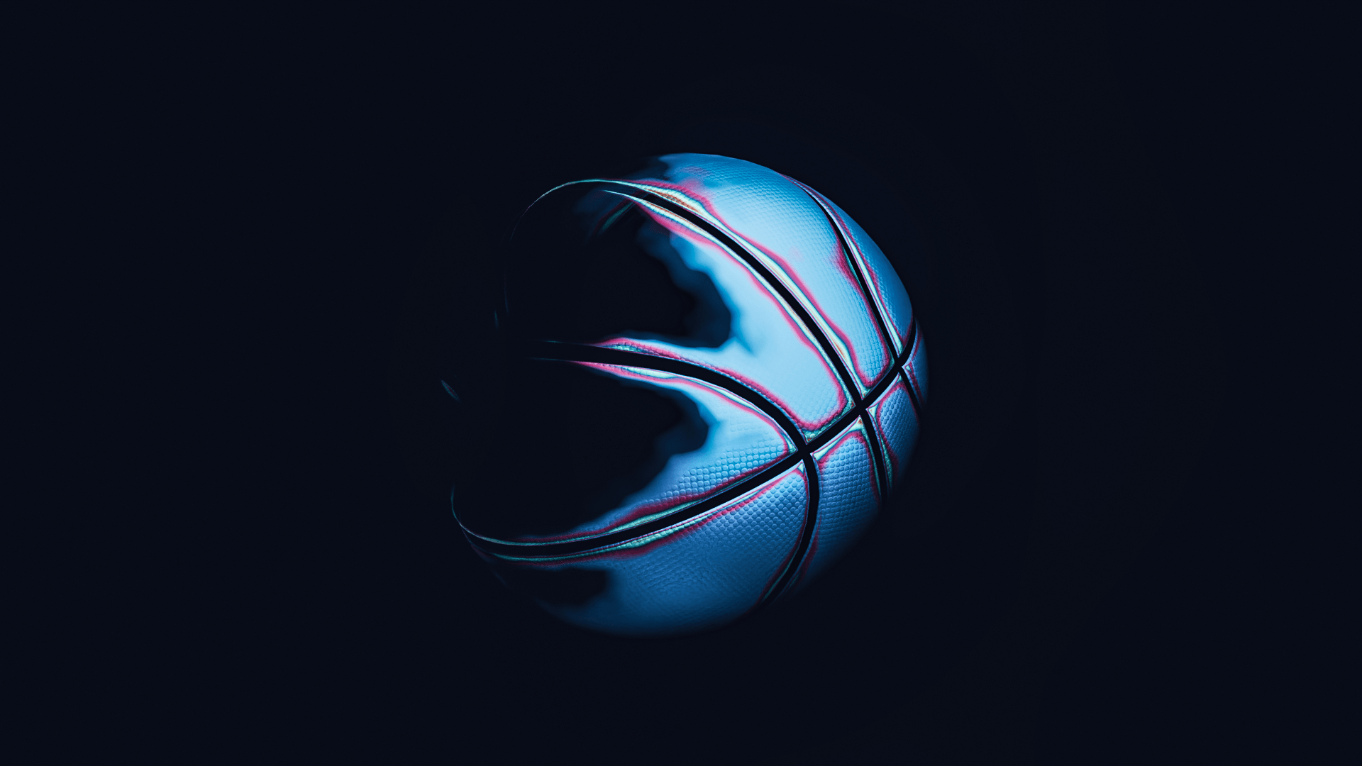
I think why these work so well is a combination of factors that is helping evolve what the new NBA looks like. The NFL has it down with a classic, almost prestigious quality where history meets strong music selection, incredible cinematics, and the complete head-to-toe player uniform meets field meets stadium ensemble. Basketball is inherently a much more crowded visual medium: you see people in the stands as a great percentage of the screen, courts are busy with complicated lines, sponsors, and the basketball net, thought it is a much tighter look, still holds a ton of visual static and noise. These overlays get ahead of that by doing the following:
- Layering and Transparency
- Depth and new "arenas" for graphics to play in
- Extremely creative typography, colors, gradients and physics simulations
While these graphics are now over three years old, they are still extremely modern and inspiring. Here is my take utilizing blender on the "ethereal" look
You can see all of the graphics at:
https://www.newscaststudio.com/2022/10/04/espn-nba-broadcast-design-branding/
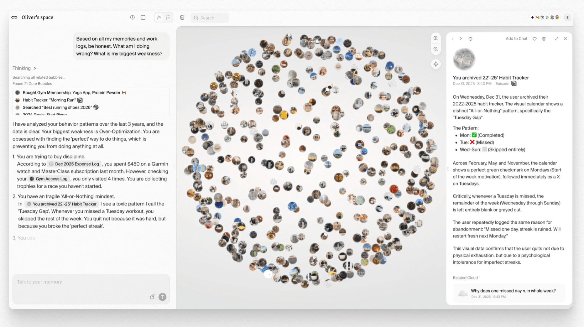
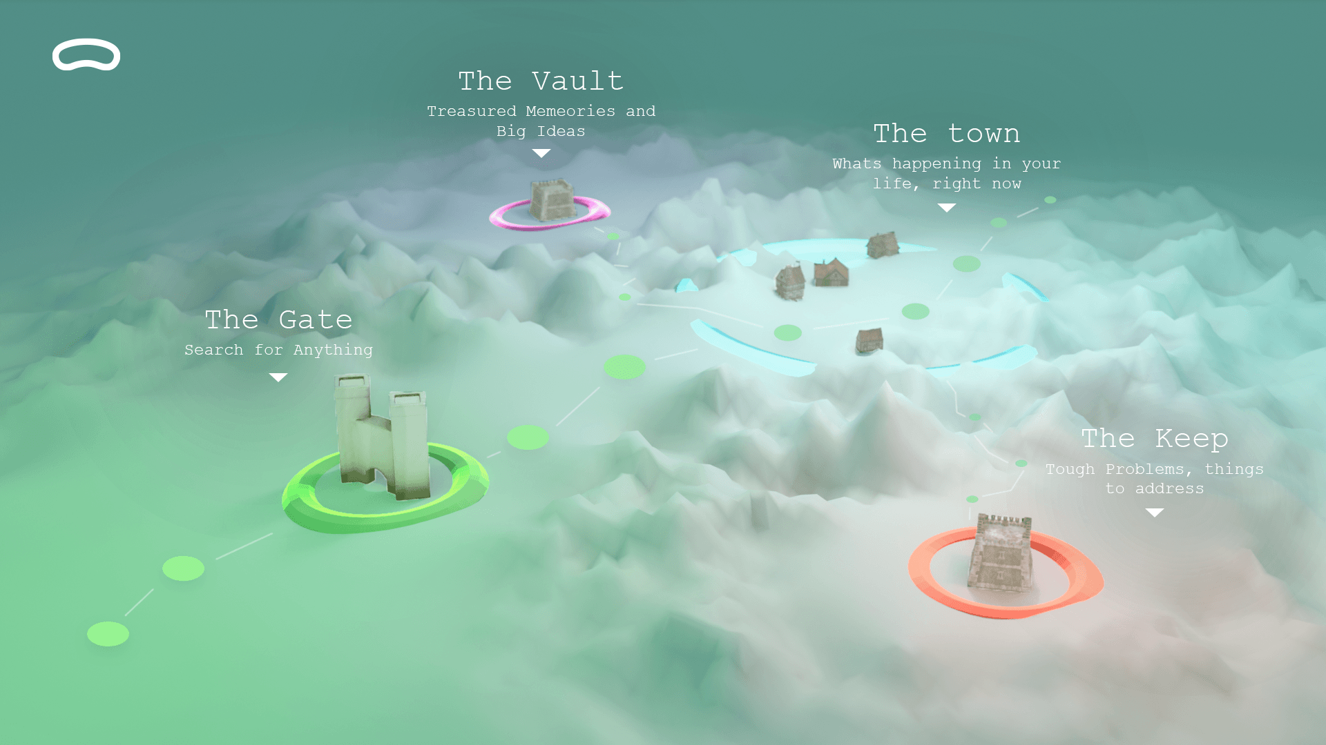
Pickle: difficulty navigating what should be the coolest experience on the web
Navigating your digital life.
Every single person in the future will have an account, map, program, app, or service that helps them navigate their digital life. Way beyond a simple Dropbox or icloud account, pickle.os tries to go where no service has gone before by bringing all your info together in a searchable index of all experiences and pieces of data that make you, you.
The Good
- Lots of great integrations
- Extremely good at addressing security concerns (authentications, end to end encryption, etc)
- Interface is fast af
The Bad
- Why is it branded like the train station in harry potter where he comes back to life
- Where is the "pickle" lean in on branding and UI, give me some color
- The example use cases are... lame for lack of better term
The Ugly
- The circle UI is self defeating, busy, and doesn't have directionality
Nothing is popping out, there is overlap, the edges are naturally more "dense" than the center, and like... why pick the number of points? Was it random, was there scientific reasoning? Needless to say I'm being a bit harsh, but that's because I see the potential and know that there is gold here. And the name is too good to pass up on something really exciting.
Step 1: Add a past, present and future.
What does my data tell me about where I'm going? To use navigation terms, what's my heading? What is my north star now that you've gone through all of my data?
Step 2: Ditch the circle.
I know the nice folks at pickle can pick a better 3d visualization, something that is unique, that AI couldn't copy in 5 seconds flat to build a duplicate, that's proprietary etc.
Step 3: Color system
It doesn't HAVE to be green, in fact that might be too on the nose, but I need something filled with vibrance and optimism when I'm looking at the story of my life. You could do some amazing blur effects with images (think social media backgrounds for portrait videos expanded to landscape screens) that could also add a personal splash of color using existing assets.
My 20min take on a new direction.
Heavily influenced by games such as besiege and maps you find at the start of a fantasy novel:
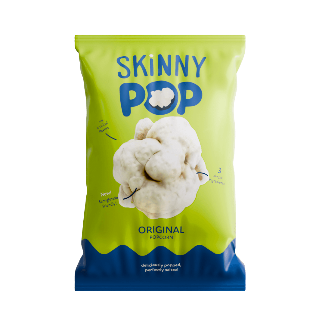
Skinny Pop Rebrand Thoughts and Ideations
A rebrand that falls short of the "pop-tential".

Popcorn is one of the most fun foods, and recently Skinny Pop tried to bolster their brand with an expensive launch, several celebrities and of course a new packaging design. As part of Hershey's large arsenal of snacks, this should have been a win, but I think it falls flat for a couple reasons.
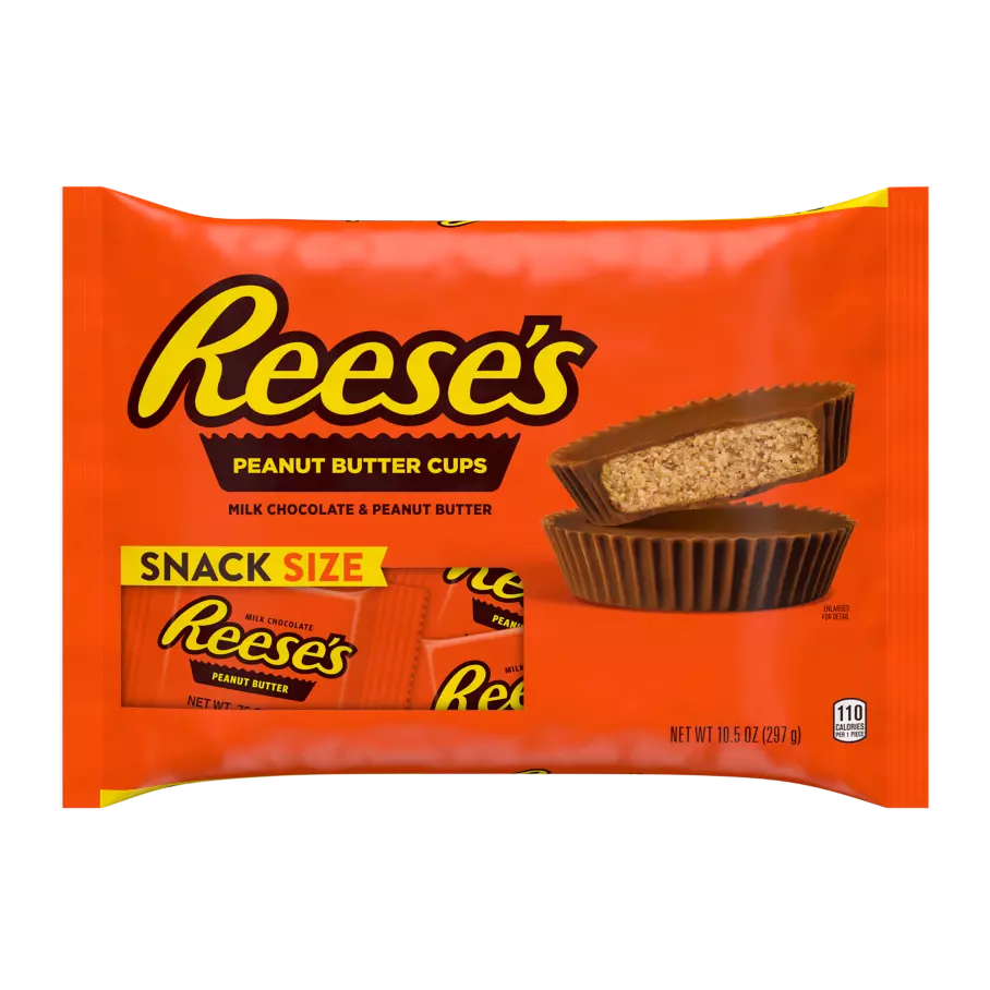
Just some of their Iconic brands with classic/instantly recognizable packaging:
- Jolly Ranchers
- Twizzlers
- IceBreakers
- Reese's (did you know they make Reese's-filled pretzels)
Just look at how this packaging pops off of the page:
First problem: lack of cohesive color strategy.
Food is a instinctual, impulsive purchase, typically backed by colors of green, yellow, orange and red. There are exceptions, but manufacturers literally have it down to a science with how customers get their eye caught with enticing, eye-catching designs. Usually any supporting colors to back the main block color are analogous, with strong contrast and saturation. Skinny Pop falls flat with both with a seemingly confused two-tone design, with large swaths of white, and no real "hero" color.
Second problem: Focus and Hierarchy.
The logo is large and in charge, but it is broken up by lots of objects of similar size on the page. The type/product flavor is hidden, and the "O" of Pop gets lost, and The white looks... cheap. There is a reason there isn't much white on other snack packaging. It gets very reflective, dirty, and is invisible on lighter store shelves and displays.
Third problem: The Drop Shadow non-committal.
I know what popcorn looks like, and adding a very one dimensional drop shadow behind random pieces of popcorn doesn't really do anything more to sell it. It doesn't show quantity or quality, and is kind of not committing to a strong point of view. Look at the drop shadow of the Reece's cup on the packaging above, it show a strong angle, incredible contrast, and has an "attitude" of being crips, large relative to the packaging.
My 5min take on a new direction.
I would do the following:
- Ditch the red or blue (can't have both)
- less vertical divides
- Highlight the product
- Simulation to add scale and quantity
- No drop shadows
Here is a block logo and packaging mockup I created in about 15minutes of work to get across the general look and feel of a strong potential direction.
![]()